How to Use a Light Pollution Map: 3 Steps to Finding Dark Skies
Picking an observing site by map color alone often leads to a frustrating result: technically dark, yet hard to observe from. This guide walks you through narrowing down about three candidate dark-sky sites near home, comparing them by Bortle class and SQM, and then vetting parking, streetlights, and sightlines on Google Maps to choose somewhere safe and genuinely usable.
One thing that trips up newcomers right away is that Bortle and SQM run in opposite directions -- lower Bortle numbers mean darker skies, while higher SQM readings mean darker skies. I'll break that down in plain terms. The real shortcut to a good observing site is refusing to take map colors at face value and instead checking Google Maps, satellite imagery, and Street View for parking access, nearby lighting, clear sightlines, and whether you can actually get in, before you ever leave the house.
What Is a Light Pollution Map? Two Metrics Every Beginner Should Know
What Light Pollution Maps Do -- and Where They Fall Short
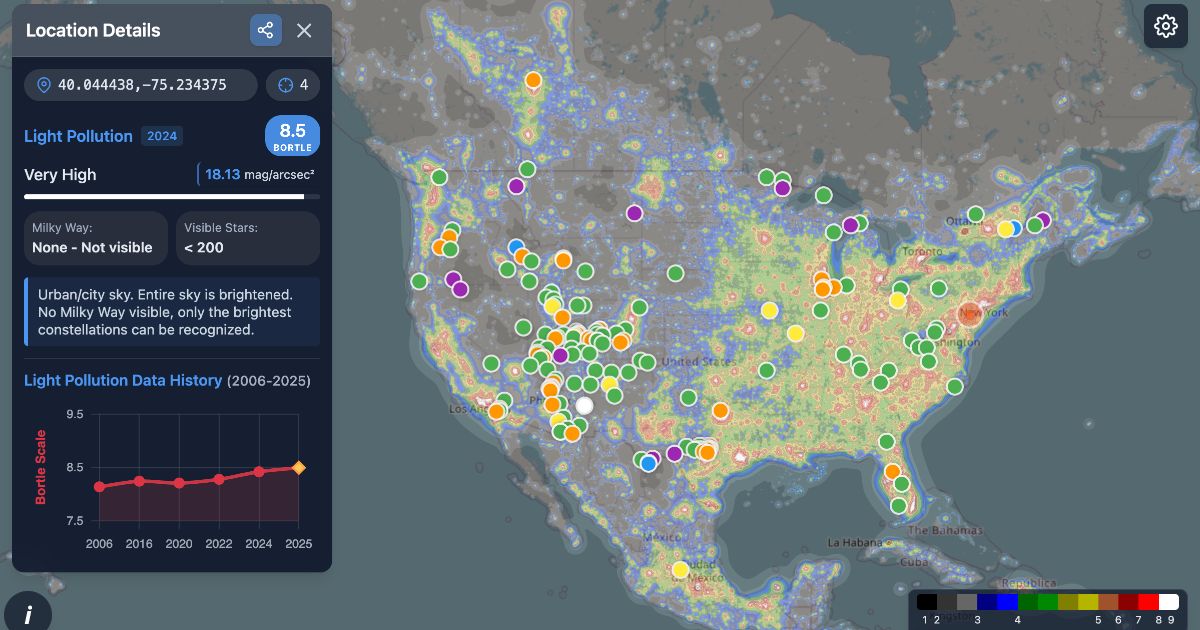
A light pollution map visualizes how much artificial light brightens the night sky -- specifically skyglow, the glow that makes the sky look washed out near cities -- across a geographic area. When searching for dark observing sites, these maps are your starting tool for identifying which mountain ranges, lakeshores, or plateaus might be dark enough to warrant a closer look. Open a resource like lightpollutionmap.info or Japan Light Pollution Map and you'll see colors mellow as you move away from urban centers, revealing pockets of darker sky.
The key thing to understand is that a light pollution map is a tool for finding candidates, not for making final decisions. Most maps show an estimate of sky brightness near the zenith -- straight overhead. Even if the zenith looks great, a city glowing on the southern or western horizon will wash out low-altitude targets like the base of the Milky Way or a meteor shower's radiant. I've stood at sites where the zenith was excellent but the lower sky was veiled in a pale glow more times than I can count.
Understanding the difference between map layers also helps you avoid misreading the data. On Light Pollution Map, you can toggle between World Atlas 2015 and VIIRS. For site hunting, World Atlas 2015 is more practical because it models skyglow -- what the sky actually looks like overhead. VIIRS is better suited for spotting where strong light sources are and tracking how areas have brightened in recent years. Think of it this way: World Atlas for sky appearance, VIIRS for light source distribution.
💡 Tip
Even when a light pollution map shows a dark area, it can't tell you about nearby streetlights, vending machines, facility lighting, or which way a parking lot faces. Treat map values and on-the-ground conditions as separate things, and you'll avoid a lot of wasted trips.
光害マップ|ボートルスケールで見る星空の暗さ (2026)
2026年版の最新光害マップ。世界中の空の暗さをボートルスケールやSQMでリアルタイムにチェックし、日本を含む天の川やオーロラ観察に最適なスポットを見つけましょう。
lightpollutionmap.appWhat the Bortle Scale Is
The Bortle scale rates night sky darkness on a 1-to-9 scale. Lower numbers mean darker skies -- 1 is the darkest possible, 9 is a city center. For beginners trying to get an overall picture, it's intuitive: you can quickly tell whether a location falls in the suburban range or deep in dark mountain territory.
That said, Bortle was originally based on naked-eye observations, so it works best as a rough observer's guide rather than a precise measurement. A Bortle 4 site on a night with excellent transparency feels noticeably different from the same site on a humid evening, and how high the Milky Way climbs above the horizon changes the impression further. In practice, Bortle is most useful for getting the broad picture, with finer judgments coming from other data.
One point worth clearing up early: Bortle runs the opposite direction from SQM. Keeping that straight from the start saves a lot of confusion when comparing numbers.
What SQM Is
SQM stands for Sky Quality Meter, and it expresses sky brightness in mag/arcsec² (等級 per square arcsecond). Higher values mean darker skies. In practice, an SQM reading in the 21 range is often cited as the benchmark for a dark sky, with 21.6 being a commonly referenced figure -- though keep in mind this varies with season, transparency, and the direction you're measuring.
It helps to understand what the numbers actually mean in terms of scale. SQM uses a 等級 system, so a difference of 1.0 corresponds to roughly a 2.5x change in sky brightness. For instance, the gap between SQM 21.0 and 20.0 is larger than the numbers suggest -- the 20.0 sky is about 2.5 times brighter. Compared to the 21.6 reference, a 20.0 sky is roughly 4.4 times brighter, which means "the faint Milky Way looks dramatically different" even when both sites seem reasonably dark.
The most widely used SQM hardware is the Unihedron Sky Quality Meter line. The SQM-L model has a narrower field of view (about 20 degrees), making it well-suited for measuring a specific patch of zenith sky. In my experience, shifting position by just a few steps can change the reading -- nearby lighting or a bright object creeping into the field of view pulls the number noticeably. SQM is a powerful tool, but the number on its own doesn't tell the full story. It always needs context: which direction you measured, and under what conditions.
Treat the Bortle-SQM Relationship as a Rough Guide
Light pollution maps sometimes display Bortle and SQM side by side, which naturally makes you want a clean conversion table. Resist that urge -- treat it as an approximate relationship.
The reason is straightforward: Bortle is a visual impression scale, SQM is a brightness measurement. The perceived presence of the Milky Way, horizon glow, transparency, humidity, and thin cloud cover can't be collapsed into a single conversion formula. Two nights with similar SQM readings can feel very different -- one crisp and star-rich, the other dark but somehow flat and lifeless. I've experienced this contrast many times at the same site.
For beginners, a practical approach is to use Bortle for a quick sense of the area, then use SQM for slightly finer comparison. Rather than trusting either number alone, reading them together -- "this spot is in a generally dark Bortle zone, and the SQM is around 21, so it looks promising" -- gets you closer to what the actual sky will look like. Numbers are helpful, but what a light pollution map really gives you is a starting point for choosing where to observe.
3 Steps to Finding Dark Skies
Step 1: Narrow Down Candidate Areas by Region
The first move isn't dropping pins one by one -- it's scanning for dark corridors across a broad area. On Light Pollution Map, start with the World Atlas 2015 layer. Because it represents sky appearance rather than raw light output, it gives you a more intuitive read on where large stretches of dark sky exist. Set your view to roughly a 90-minute driving radius from home (or, if you're traveling, whatever you can round-trip in an evening), and scan for dark zones along mountain ranges, lakeshores, highlands, and coastlines.
At this stage, avoid committing to a single point. Instead of jumping to "this parking lot looks good," first think in broader terms: "this mountain range runs dark," "the north shore of this lake is shielded from city light," "this highland ridge should have open sightlines." That mindset produces better candidates. Before any trip, I look at the overall light-and-dark pattern across the map rather than chasing individual dark specks, identifying where urban glow doesn't reach. That approach leads to fewer dead ends once I start checking specific parking areas and viewpoints.
While scanning, overlay major roads on your base map so you can gauge accessibility at the same time. A patch that's wonderfully dark but accessible only by unpaved forest roads can be more trouble than it's worth for someone just starting out. Conversely, a dark zone near a national highway or major regional road is worth the effort of a detailed check. If your map shows terrain or elevation, you can also start filtering: ridgelines and plateaus generally offer wider horizons than valley floors.
Aim to keep at least three candidate areas at this stage. With only one option, you're stuck if the site turns out to have strong lighting, no parking, or limited sky views. If you're in the Kanto region of Japan, for example, the area around Okutama Lake (about two hours from central Tokyo) is a classic dark-sky destination. With a bit more driving range, the Senjogahara marshland in Nikko -- an open highland wetland -- is another area that's easy to evaluate at the regional scale. Start by lining up three types of candidates: a dark mountain area, a dark lakeshore, and a dark highland. That makes the comparison work in Step 2 far easier.
Step 2: Read the Numbers
Once you've identified broad dark areas, click specific points within them to read Bortle class, estimated SQM, and zenith brightness. The division of labor is simple: Bortle gives a quick beginner-friendly grade, SQM adds a finer layer of detail. Just remember the direction each runs: lower Bortle = darker, higher SQM = darker. Getting that mixed up when comparing candidates is an easy mistake to avoid if you lock it in now.
In practice, clicking through to the actual values is more reliable than relying on color alone. Two spots that look equally "dark" on the map can have SQM readings that differ just enough to matter. Because SQM uses a 等級 system, a difference of 1.0 means about a 2.512x change in sky brightness -- small-looking gaps translate to real visual differences. When I compare candidates, I start by checking Bortle to confirm the broad picture, then rank by SQM. That order keeps things clear even for newcomers.
The often-cited reference of SQM 21.6 is useful as a benchmark but not an absolute standard. If a candidate site reads SQM 20.0, that's roughly 4.4 times brighter than a 21.6 sky. Numbers are excellent for comparison, but pairing them with a reminder that actual conditions vary by season and transparency makes the assessment more honest.
Layering in VIIRS annual data and the Trend view adds a freshness check to your candidates. World Atlas 2015 is great for site hunting, but it can't fully reflect new facility lighting or recent development. VIIRS offers year-by-year views from 2012 through 2024, and the Trend layer visualizes changes from 2015 to 2024. If a brightening corridor has appeared near one of your candidate points in recent years, the site may be more washed out than the static map suggests. On the flip side, a dark corridor that has stayed stable over multiple years is a stronger candidate.
ℹ️ Note
Numbers are handy for ranking, but rather than declaring a winner based on a single value, reading World Atlas 2015 for the broad picture, clicking for Bortle and SQM, then checking VIIRS for recent light source changes as a three-part set gets you closer to what the sky actually looks like on site.
Step 3: Ground-Truth the Candidates
Candidates that survived the numbers round face their toughest filter here. The task is straightforward: toggle between Google Maps' map view, satellite imagery, and Street View to identify anything that would cause problems at night. A light pollution map tells you about regional darkness, not whether the parking is workable or whether there's a floodlight ten meters away. In my experience, "the sky is dark but the vending machine next to the car is blinding" and "great viewpoint, but the southern horizon is completely blocked" are not unusual outcomes.
Start with parking logistics. A wide-looking shoulder might actually be too narrow to stop safely, and a facility parking lot may have restricted hours. Satellite imagery reveals lot size, room to turn around, and distance from nearby structures. Map view shows road entrances and junctions. Sites that are hard to get confused about on arrival are strong candidates just for that reason alone.
Next, look for nighttime lighting. Streetlights are obvious, but convenience stores, vending machines, tourist facility exteriors, restroom buildings, and hotel floodlights are equally disruptive. Daytime Street View can be deceiving -- look specifically for pole-mounted lights, tall parking lot fixtures, and the glow of vending machines. These point sources of artificial light wreck an observing session more than the map's broad numbers would ever suggest.
Then check sightlines. Satellite imagery reveals tree lines, embankments, buildings, levees, and ridge spurs that block portions of the sky. For stargazing, it's not just about the zenith -- whether you can see the direction where the Milky Way rises or where a meteor shower radiant will appear makes or breaks the session. Lakeshores can be hemmed in by mountain shadows, wetlands by surrounding trees along boardwalks, and mountain passes by guardrails and cut slopes. A place like Senjogahara, known for open terrain, still varies depending on the exact relationship between its parking areas and facilities, so the more open a site appears, the more the details matter.
Also be aware of operational restrictions at specific sites. Around Okutama Lake in Japan, for instance, the Yamanofurusato Village entrance gate closes at 17:00, and sections of the Okutama Toll Road are closed to traffic at night -- details that eliminate otherwise dark-looking spots. National parks and tourist areas often have very different rules after dark.
Save and Share Your Candidates
Once you've narrowed down to about three sites, storing them in a format that's easy to compare keeps your decisions grounded. Light Pollution Map and Japan Light Pollution Map let you share URLs that include coordinates and zoom level, so bookmarking the URL for each candidate is the simplest useful step. Because the zoom position is preserved, you can revisit "this north lakeshore" or "beside this mountain pass parking area" without searching from scratch.
If your map supports bookmarks, saving candidates as Site A, Site B, and Site C makes it easy to compare Bortle, SQM, and road conditions at the same scale later. I usually add short notes alongside each -- things like "easy parking," "southern horizon open," "lighting nearby, backup candidate." Real-world trip planning benefits more from that kind of annotated comparison than from numbers alone.
The same logic applies to sharing. If you're going with someone, sending the coordinate URL directly prevents any confusion about the meeting point. Having multiple candidates ready also lets you switch on the night itself based on cloud cover or driving direction. When you've organized everything at the saving stage, your site search graduates from "I think I found somewhere" to a practical shortlist you can actually act on.
Reading Light Pollution Map: Recommended Settings
World Atlas 2015 vs. VIIRS
The first point of confusion on Light Pollution Map is understanding what World Atlas 2015 and VIIRS each show. Despite being listed side by side, they measure fundamentally different things. World Atlas 2015 maps the estimated brightness of the night sky (skyglow) -- the result of city and road lighting scattering through the atmosphere. VIIRS, on the other hand, shows ground-level radiance as captured by satellite, making it effective for identifying where light sources are concentrated.
This distinction directly shapes how you search for sites. What matters for stargazing is not the light sources themselves but how dark the sky looks when you look up. For that reason, World Atlas 2015 is the more practical starting layer. A distant light source can still brighten your sky through atmospheric scatter, while a nearby small source might be blocked by terrain. World Atlas 2015 reads closer to "what the sky overhead feels like," which is why beginners especially should anchor their search there.
I always start my initial screening with World Atlas 2015. VIIRS on its own tends to pull your attention to bright point sources, making it harder to get a feel for how dark the overall sky is. Flip it around -- find dark corridors on World Atlas 2015 first, then switch to VIIRS -- and it becomes much easier to spot "where is the light that's eroding this darkness?"
Recommended Layers and How to Use Them
A practical default setup is to search for sites on World Atlas 2015, then overlay VIIRS annual data and the Trend layer as needed. That combination covers both the overall darkness picture and recent changes.
Light Pollution Map's documentation notes that VIIRS supports year-by-year display from 2012 to 2024, while Trend covers 2015-to-2024 comparisons. These features let you check whether the area around your candidate has brightened recently.
For example, a lakeshore or highland candidate that looks clean on World Atlas 2015 might show a new logistics center or a growing light strip along a highway when you scrub through VIIRS years. Sites like that can have washed-out lower skies despite looking dark at the map center. Conversely, a dark zone that has stayed stable across multiple years has a reliability advantage for trip planning.
Keep your base map set to something that shows roads and terrain clearly. Light pollution layers alone don't reveal parking lot locations or road junctions, so toggling between map view and satellite imagery ties back into the ground-truthing from the previous step. For searches focused on Japan, the Japan Light Pollution Map from Astrotourism Lab is a handy complement -- its domestic base map and observation-related layers streamline the candidate management process.
What You See When You Click a Point
One of Light Pollution Map's most useful features is that clicking a point displays estimated zenith brightness data. The popup shows Bortle scale, estimated SQM, and zenith luminance, making it easy to compare candidates numerically. Bortle uses a 1-to-9 scale, and SQM is displayed in mag/arcsec². Higher SQM = darker sky.
This is especially valuable where color differences are subtle. Two points that look similar in color can turn out to be a full Bortle class apart, or show a meaningful gap in estimated SQM. When comparing candidates, I typically start by scanning colors broadly, then click through to confirm "how dark is the zenith here, really?" Putting a number on it separates sites that seem decent from those worth keeping.
One caveat: smartphone or camera-based sky quality estimates are sensitive to conditions (camera performance, exposure settings, sky state), and practical reports suggest errors of plus or minus 1-2 Bortle classes are common. These tools are useful as supplementary indicators but shouldn't replace a dedicated SQM meter. Cross-checking with multiple methods is always preferable when possible.
💡 Tip
Knowing how to read SQM differences changes your judgment. A gap between 21.0 and 20.0 looks like "just one unit," but it represents roughly a 2.5x difference in sky brightness. Compared to the commonly cited 21.6 reference, a 20.0 sky is about 4.4 times brighter -- so even small numerical gaps carry surprisingly large visual weight.
Sharing Coordinate URLs and Using Bookmarks
The part that pays off after you've found candidates is coordinate URL sharing. Light Pollution Map encodes the current point and zoom level in the URL, so bookmarking it preserves exactly what you were looking at. This is more useful than it sounds -- revisiting a candidate weeks later without having to re-search the location name saves real time.
In practice, storing separate coordinate URLs for each candidate works better than saving just the place name. Annotating them -- "easy parking at lakeshore," "wide southern view from this pass," "lighting nearby, keep as backup" -- turns a raw darkness comparison into a list that accounts for on-the-ground conditions. When sharing with someone joining your trip, sending the coordinate URL eliminates ambiguity about where exactly to meet.
If your map tool supports bookmarks, grouping them by trip region makes it easier to revisit and re-evaluate. I often don't finalize everything in one sitting -- I'll save the URLs and revisit them seasonally. In summer, the low southern sky matters most; in winter, parking ease and road conditions carry more weight. The same site can shift in priority depending on the season.
For Japan-focused searches, the Japan Light Pollution Map offers a similar coordinate sharing and bookmarking experience with a domestic map base, making it easy to use alongside Light Pollution Map for candidate management.
Why Map Colors Alone Lead You Astray
Horizon Glow
What a light pollution map primarily shows is how dark the zenith is at a given point. The pitfall is assuming that a dark zenith means the entire sky is dark. On site, you'll often find that overhead is a deep, satisfying black while the sky near the horizon is washed with a pale dome of city light. This mismatch between zenith and horizon is one of the most common disappointments.
The effect is directional. A site with a large city to the south may have a glowing southern horizon while the northern sky remains pristine. A lakeshore or mountain pass with a valley or highway on one side can show a murky band only in that direction. Two candidate sites with identical map colors can deliver very different experiences depending on which direction is open and which direction faces a population center. I've stood at sites where the zenith was textbook dark but the lower portion of the Milky Way was swallowed by horizon glow more times than I'd like to admit.
The World Atlas 2015 and VIIRS layers discussed earlier are helpful for narrowing candidates, but on the ground, you need to think about which altitude and which compass direction you'll actually be using. For nights when you're targeting low-altitude objects, it's not enough to know the site is dark -- you need to know which horizon directions are prone to light contamination.
The Trap of Nearby Lighting
The other thing maps can't reliably show is "near-field" light -- sources right at your observing location. Streetlights, vending machines, parking lot fixtures, restroom night-lights, and illuminated signs may be invisible on a regional light pollution map, but they hit hard on site. They compromise your view and your dark adaptation before broad skyglow even enters the picture.
What surprises beginners most is that a single light source is enough to cause problems. Standing at the edge of a parking lot might seem far enough away, but a white LED fixture catching the corner of your eye instantly flattens your perception of fainter stars. A vending machine that's just a featureless dot on a map becomes a glaring beacon after dark. Ironically, "dark-sounding" locations like lakeshores, parks, and scenic overlooks often have minimal but strategically annoying lighting installed for visitor safety.
These near-field sources don't register on World Atlas or VIIRS. That's why the candidate vetting stage calls for Google Maps satellite imagery and Street View: check parking lot layouts, building positions, restroom and shop placements, and whether road-facing lights are present. Even when I find a map-dark site, my final check is always "where can I park the car so no fixture lands in my field of view?" Two sites with identical darkness values on paper can feel worlds apart depending on whether you can physically get away from the nearest light.
ℹ️ Note
The number of stars you see in a dark location depends not just on the sky's potential but on how fully your eyes have adapted to darkness. That moment when you walk a short distance from a bright parking lot and suddenly "more stars appear" usually isn't the sky changing -- it's the near-field light pollution dropping out of your visual field, letting your dark adaptation catch up.
Humidity, Atmosphere, and Moonlight
A site that looks outstanding on the map can underperform dramatically depending on atmospheric conditions that night. High humidity, haze, and thin cloud cover scatter distant light through the atmosphere, making the sky appear brighter than the map would predict. The effect is strongest near the horizon, where you're looking through more atmosphere at a shallow angle. A mountain ridge that cuts a sharp silhouette on a dry night can look like it's glowing on a humid one.
Moonlight is another factor no map accounts for. Even at a genuinely dark site, the Moon's presence washes out faint nebulae and the Milky Way, and lights up the ground enough to undermine the feeling of true darkness. And don't overlook twilight: the sky isn't as dark as it looks right after sunset. During the twilight period, even a site with strong map credentials will appear underwhelming. If you judge a site based only on your impression immediately after arrival, you may be mistaking lingering twilight for the location's actual performance.
From my own experience, the same candidate site can feel a full class darker on a dry, moonless night versus a humid night or a night with the Moon up. Map colors represent a location's baseline potential, but the sky you actually look up at varies with humidity, atmospheric transparency, cloud cover, and moonlight every single time. When the map and reality don't match, it's usually not the map that's wrong -- it's that the sky is never the same twice.
Conditions to Check Before Every Observing Session
Moon Phase and Moonrise/Moonset Times
When checking conditions for an observing night, the first thing beginners should look at -- even before weather -- is the Moon phase and its rise and set times. No matter how dark the site is, the Moon lights up the entire sky when it's above the horizon, burying faint stars and the Milky Way. Around full Moon, even the ground is bright enough to cast shadows, which is a common reason people come back from a dark site feeling like they saw fewer stars than expected.
The sweet spot is around new Moon, or at least a night where the window between moonset and moonrise is long enough to use. A waxing crescent sets early, leaving the second half of the night dark. A waning Moon past last quarter doesn't rise until the small hours, so you can observe in darkness until then. When I plan a session, the first question is always "what hours are Moon-free that night?" Getting that window right makes a bigger difference than almost any other variable at the same site.
A subtler trap is checking only the Moon phase and calling it done. A thin crescent still lingering in the western sky during your planned observing window will brighten the low horizon. A Moon that rises at 2 AM splits the night into two different experiences. For practical planning, "is the Moon above the horizon during the hours I'll be observing?" is a better question than "is it close to new Moon?"
Cloud Cover, Transparency, and Wind
Even with ideal Moon conditions, poor sky quality can undo everything. Cloud cover is the next check, but simple precipitation probability isn't enough. For stargazing, high-altitude and mid-altitude clouds matter most -- a forecast showing no rain can still mean a thin overcast that softens stars and spreads urban light into a glow. Nights that look clear to the casual eye can turn out to be hazy and flat for observing.
Rather than relying on a single weather app, comparing multiple forecasts reduces the risk of a bad call. Even just checking whether cloud cover predictions agree and whether hour-by-hour trends match across sources improves your judgment. When I have multiple candidates for the same night, I compare cloud forecasts side by side, looking for whether mountain-side sites will be socked in while lowland sites stay clear, or vice versa. Even within the same region, the windward side of a mountain range can hold clouds while the lee side opens up.
Transparency is an underappreciated factor. A clear sky with high moisture or particulates in the atmosphere produces soft star images and a whitened horizon, especially at low altitudes. A dry night, by contrast, brings out star colors and Milky Way structure. You don't need to parse numerical forecasts in detail -- if the night promises low clouds, moderate wind (enough to keep air circulating), and no haze, even a beginner will notice the difference in sky quality.
Wind affects more than comfort. Strong wind drops your effective body temperature, shakes binoculars and tripods, and makes it genuinely difficult to stand still and study the sky. Lakeshores, highlands, and marshlands often feel windier at night than during the day, and "stronger than the forecast suggested" is a common experience on site. Evaluating wind alongside sky quality -- not as an afterthought -- makes the difference between an enjoyable session and one you cut short.
Twilight and Dark Adaptation Basics
Something beginners often overlook is that the sky isn't truly dark right after sunset. Even after the colors of sunset have faded, twilight lingers, and it takes time for the sky to reach observing-quality darkness. As a general guide, full darkness arrives roughly 1 to 2 hours after sunset; planning around the end of astronomical twilight keeps your expectations aligned with reality.
Arriving early is fine, but don't judge the site by your first impression. During lingering twilight, even a genuinely dark location will look underwhelming. I've had people at star parties tell me "there aren't many stars tonight," only to look up 30 minutes later and find the sky packed. The site hadn't changed -- it just hadn't finished getting dark yet.
Once darkness does arrive, dark adaptation plays a major role in what you can see. Your eyes don't switch to night mode instantly; sensitivity builds gradually after you enter darkness. Most beginners notice a clear improvement after 5 to 10 minutes -- stars seem to multiply. But looking at a parking lot light or a phone screen resets this process quickly, which means the first few minutes at a site and the minutes after your eyes have settled will look like completely different skies, even though nothing above you has changed.
ℹ️ Note
Instead of rushing to evaluate the sky, let astronomical twilight end and give your eyes a few minutes to adjust. Just those two steps can dramatically increase the number of stars you pick up with the naked eye. For beginners especially, "when you start looking" and "how adapted your eyes are" matter as much as where you chose to go.
Safety, Gear, and Planning Your Return
The darker a site is, the more nighttime-specific constraints come into play. The critical things to verify are overnight road closures, gate lockout times, access restrictions, and parking availability. For stargazing, the question isn't just "can I reach a dark site?" but "can I legally enter at that hour, and can I get back out?" Around Okutama Lake in Japan, for example, the Yamanofurusato Village gate closes at 17:00, and sections of the Okutama Toll Road are closed at night, eliminating otherwise promising parking areas. Dark-rated sites that don't function after dark are more common than you'd expect.
Even popular areas like the Senjogahara marshland in Nikko have nuances -- large parking lots may be convenient, but facility-specific sections and seasonal operating differences come into play. Tourist areas and national parks often operate under very different rules after sunset. I've arrived at sites that looked excellent on paper only to find gates, fences, locked restrooms, or post-closure facility access issues that made observing impractical. Researching nighttime operations is as important as researching darkness.
For gear, prioritize safety over fancy equipment. A red-light headlamp lets you see your footing without destroying your dark adaptation. Dress warmer than you think you need, regardless of season -- nighttime lakeshores and highlands cool off fast, and standing still for extended observing drops your body temperature steadily. Reflective clothing or a vest also helps make you visible to vehicles in parking areas and roadside spots. In genuine darkness, "I can see the car" and "the car can see me" are two very different things.
Build your return trip into the plan from the start. Mountain and lakeside areas can lose cell service, and convenience stores and gas stations close late at night. If you'll be driving a long distance during the drowsy hours, decide in advance where you'll stop to rest and which route you'll take back. I've noticed that the better the sky, the later I tend to pack up. The satisfaction of a great observing session and the logistics of getting home safely need to stay in separate mental compartments to keep the whole trip on track.
A Beginner's Brightness Guide: What Can You See at Each Level?
Urban to Suburban Skies
Bortle 6 to 5 is roughly the sky most beginners are already familiar with. Near train stations and residential neighborhoods, the brightest stars stand out, but your practical limit is around 等級 2-3 stars. You can trace constellation patterns, but the fainter stars that fill in the gaps are missing, and the sky background has a persistent pale wash.
At this level, picking out the Milky Way with the naked eye is a stretch. Even looking toward the well-known summer band, the typical experience is "there might be something whitish there, but I'm not sure." At public star parties under these skies, first-timers often feel like there are fewer stars than they expected.
That doesn't mean these skies have nothing to offer. Binoculars make a real difference here -- bright open clusters and double stars become surprisingly satisfying targets. Rather than expecting a dramatic naked-eye transformation, treating this range as a place to start picking off brighter objects tends to leave people happier.
Dark Suburban to Semi-Dark Skies
Once you reach Bortle 4 to 3, even beginners tend to notice that "the black is different." Stars that were missing in suburban skies fill in, and the density of points between constellation lines increases noticeably. This is often the first range where people feel a trip was genuinely worth the drive.
On a good night, the Milky Way can become visible as a band. Not the dramatic river of the best photos, but a real step beyond the "where is it?" experience of urban skies -- a faint stripe running across part of the sky that you can actually identify. Think of it as going from undetectable to present.
This range is also where the numbers on a light pollution map start connecting to naked-eye experience. A single Bortle class difference carries more visual weight than you'd expect, and at the SQM level, a 1.0 difference means about a 2.512x change in sky brightness. As readings drift into the low 20s, the same "clear night" starts to feel a layer deeper in background darkness.
ℹ️ Note
The best starting point for beginners to experience "what a darker sky feels like" isn't an extreme wilderness -- it's the Bortle 4-3 range. These sites balance accessibility and safety with a naked-eye difference that's easy to appreciate.
Truly Dark Skies
Bortle 2 to 1 is the range described as dark sky, or exceptional sky. Under these conditions, the Milky Way stops being a uniform white band and starts showing structure -- dense regions, faint regions, and the dark rifts cutting through it become accessible targets. Rather than stars scattered across the sky, you get a sense of stars layered in depth, and even naked-eye observing yields noticeably more information.
An SQM reading around 21.6 is often referenced as a benchmark for pristine natural sky. But SQM is influenced by that night's transparency and surrounding light leakage, so the number is a strong darkness indicator rather than an absolute beauty score. I've had nights at remote sites where the numbers were solid but humidity made the sky feel sleepy, and other nights where the sky outperformed its numbers with a crispness that's hard to describe.
Managing Expectations: Photos vs. Naked-Eye Reality
This is where the biggest misconception lives. Even under dark skies, the Milky Way through your eyes will not look like a long-exposure photograph. A camera accumulates light over seconds or minutes and amplifies color and contrast; your eyes process light in real time. That gap means arriving at a Bortle 2 site with astrophotography-level expectations almost guarantees disappointment.
What actually happens with naked-eye observing is a gradual deepening. First, you notice more stars. Then the sky background darkens. Then, as your adaptation builds, you start picking up the Milky Way's band and its uneven brightness. What was invisible in the city becomes present in suburban dark, and gains structure under truly dark sky -- it's a progression, not a switch.
The Bortle and SQM displays on a light pollution map serve as tools for calibrating these expectations. Bortle is the coarse experiential bracket, SQM the finer continuous measure. Both help you imagine what a site can deliver, but interpreting them as guides to how many more stars you'll see and how findable the Milky Way will be -- rather than as previews of a finished photograph -- keeps your on-site satisfaction much more closely aligned with reality.
Final Thought: For Your First Trip, Choose a Safe, Accessible Site Over the Darkest One
For your first stargazing outing, chasing a perfect Bortle 1 matters less than picking a site you can reach comfortably and observe from safely. Factor in access, sightlines, parking, and Moon phase alongside map darkness, and you're far more likely to come home thinking "that was worth it." In my experience, a moderately dark site with good conditions often becomes a more reliable long-term observing spot than a remote location that's slightly darker but harder to use. Start with an accessible candidate, and go see the night sky for yourself.
Related Articles
The Bortle Scale Explained: What Classes 1 Through 9 Really Mean
The Bortle Scale Explained: What Classes 1 Through 9 Really Mean
When searching for dark-sky sites, you'll encounter terms like the Bortle Scale, SQM, and NELM, but the numbers alone don't always convey how dark a sky actually is. This guide breaks down how to read night-sky darkness for beginners heading out to stargaze, as well as anyone who stares at light pollution maps and still isn't sure where to go.
How to Start Stargazing: 5 Steps You Can Do Tonight
How to Start Stargazing: 5 Steps You Can Do Tonight
You don't need a telescope to start stargazing. Begin with bright, easy targets like the Moon and Venus, then gradually add binoculars and — if you want — a telescope. Starting with naked-eye objects and building from there is the approach least likely to leave you discouraged.
How to Find Nebulae and Star Clusters | Deep Sky Beginner's Guide
How to Find Nebulae and Star Clusters | Deep Sky Beginner's Guide
Nebulae are clouds of gas and dust, star clusters are groups of stars, and galaxies are massive island universes of stars and gas. Even though the names sound similar, what you see and how you find them differ enough that sorting this out first makes the night sky much more readable.
Stargazing Gear Checklist | 7 Essentials Beginners Always Forget
Stargazing Gear Checklist | 7 Essentials Beginners Always Forget
When it comes to stargazing gear, there are things you should sort out before you even think about a telescope. For your first night under the sky, three things come first: a red light, warmth and insect protection, and a way to find stars. Here are the 7 essentials that beginners consistently overlook.